
I. Introduction

The Zelda series’ venture into dark fantasy [questionable] was brought to us with 2004‘s Twilight Princess. The game divides its explorable world into the Light- and Twilight Realm — the latter of which will be the focus of this creative analysis.
When the idea for this blog first sparked in my mind, I immediately knew that Twilight Princess would soon fall victim to my ramblings. It left a lasting impact on my own creative process that I couldn’t ignore.
I will attempt to deconstruct Twilight Princess’ atmosphere on an intricate level, examining in detail how its artists achieved a strikingly sombre setting, going from its visual identity to musical composition.
(That’s right: I’m getting you to read about music theory! Please don’t leave... I promise it’s cool...)
Also, this article ended up much bigger than anticipated, so before you go, take this!
|
I.: Introduction II.: Analysis A) Color Theory |
For those who quit reading and come back later, or those who want to skip to the part they're most interested in. I see you and you're valid, too! |
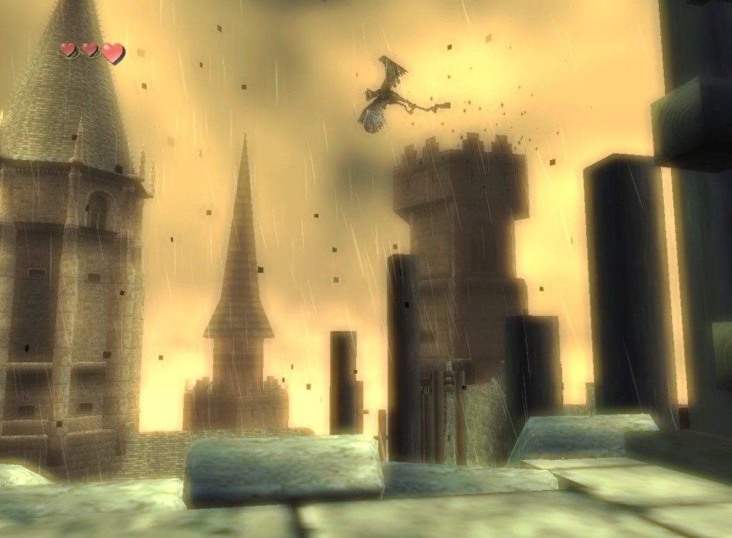
[Screenshot of Twilight Realm]
When the player is first politely abducted into the Twilight Realm, it immediately creates stark emotional contrast to the serene peacefulness of Ordon Village, the game’s starting environment and Link’s home.
Whereas the woods of Ordona felt light, free, the Twilight Realm greets us by chaining the player up in a claustrophobic, run-down prison cell, black particles floating through the air we breathe, and a hauntingly dissonant melody chiming in the background.
Link finds himself not in his own body, but now metamorphisized into the form of a wolf. A new, yet unnamed character with abnormal powers proposes to lend us a hand in our escape, and left with no other choice, we crawl through tight tunnels filled with spirits of haunted soldiers and hostile, shadow-like creatures.
The suffocating atmosphere continues in a nightmarish manner, as the outside world is enveloped by a blinding amber sky, covered in a thick smog. The rooftops we now find ourselves on are at wuthering heights, patrolled by large, vulture-esque monsters that hunt and attack the player. It is soon revealed that this surreal location is the husk of Hyrule Castle, once a beacon of safety for the kingdom, now withering away into the hands of Twilight.
The Realm of Twilight can be described in many suiting adjectives: Distressing, stifling — one might also argue melancholic.
But what techniques did the artists use to create this distinct atmosphere?
II. Analysis

Color Theory
For one — Twilight Princess is a masterclass on how to create a striking visual identity through color contrast.
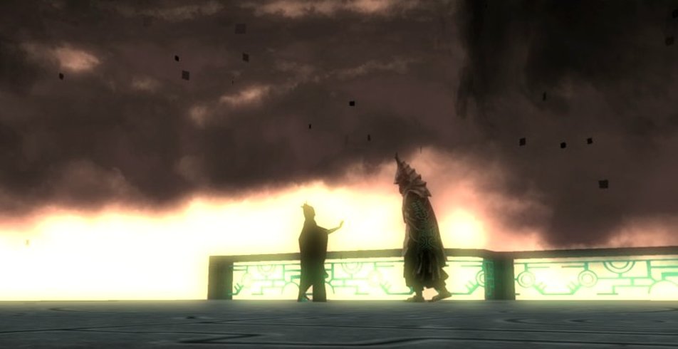
The Twilight Realm’s overarching color palette consists of three major tones:
|
 |
By limiting their range to this trifecta, the artists successfully envoke three essential color contrast theories.
| Most importantly, we are observing the effects of "simultaneous contrast," meaning our brains notice, and emphasize, the dissimilarities in saturation of two colors in proximity to each other. Simply put, when a color with strong saturation is placed closely to a color with notably weaker saturation, it will steer our brains‘ attention to the former color, making the latter feel much less important. |  |
In our example, this refers to the "muddy," lifeless colors of the environment held against a lush, warm sky. As a player, this rather attention-grabbing skybox make us feel small, insignificant, suffocated.
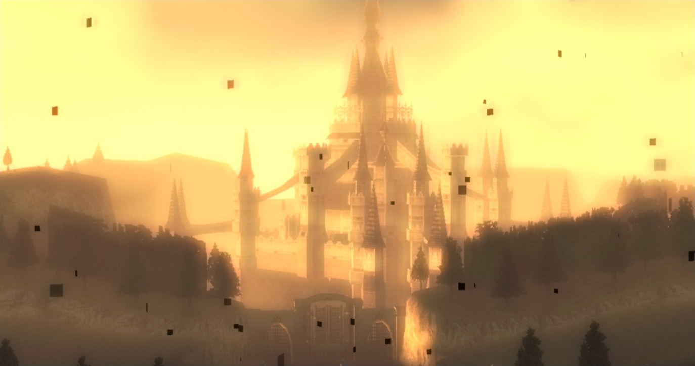
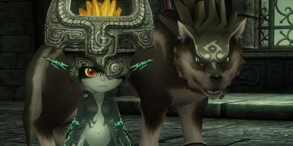
And it is here, where our turquoise accent color really comes to shine. As it contrasts with the drab environment, the Turquoise highlights important objects and characters. It also guides the player by marking pathways. …Much more tactfully than the infamous yellow paint/tape.
The reason Turquoise works so well is because it creates a sharp tension with the afformentioned Amber based on two other important color contrast theories.
| Namely, these two colors would be considered "complementary." Using this popular visualization of the color wheel, we can observe that our two colors are directly opposed to each other — that they could not be any more distant in their values. In addition, Amber is a color that projects warmth, which, in proximity with the cool-toned Turquoise, creates a contrast in "color temperature." |
|
The result is an accent color that is remarkably eye-catching and enigmatic. It is worth noting here that Midna, who is integral to the plot, wears both the Amber and the Turquoise in her color palette — an effective way of signalling her significance.
In-Game Visual Effects
|
|
|
Like most modern film and gaming, the visual effects artists were doing a notable amount of heavy lifting in crafting the piece's atmosphere.
Most notable here are the color adjustments, which tint the world in a warm Amber hue, creating our familiar color palette.
However, the effects of this game go far, far deeper.
One effect that immediately jumped out at me was light bloom, a staple of 3D video games, used here in a very unique way to create a feeling of unease.
Light bloom is supposed to invoke the imperfection of camera lenses and the human eye by emulating the way bright lights will cause colors to "bleed" beyond their natural borders.
Typically, how much bloom is applied to a scene is a static variable — the bloom does not change in its intensity, with a few exceptions, like for example in the Halo games, where quickly transitioning from a dark room into the bright sunlight will shortly intensify the light bloom, simulating the way our eyes have trouble adjusting to drastic changes in lighting.
In Twilight Princess' Twilight Realm bloom is always active. However, the artists constantly wave its intensity up and down, creating a "pulsating" effect, as if the player's eyes are perpetually stuck trying to adjust to their surroundings.
This effect is very subtle but contributes a remarkable feeling of being dizzy, lost, ill. To me, this effect is reminiscent of the heightened light sensitivity I experience when overstimulated or when having a migraine. Bloom is also commonly associated with a dream-like quality, making the Twilight Realm feel blurry and surreal.
I believe Twilight Princess is much too criticised in its art direction, many people dismissing its many intrecacies due to it being victim of attempted realism in early 2000's CGI.
Feeling bold, I just produced a chunky, beginner-friendly creative analysis on the nuance of Twilight Princess' visual identity and musical composition.
I think if you're an artist, experienced or not, there's a lot of valuable things to learn from Twilight Princess, especially so if you are fascinated by its melancholy and surrealism.
Enjoy!
Welcome to the comment section!
If you don't want to use your own email/account to sign up, this worked for me.
Let us hear your thoughts below!
And please — keep it civil. [Comment Rules]

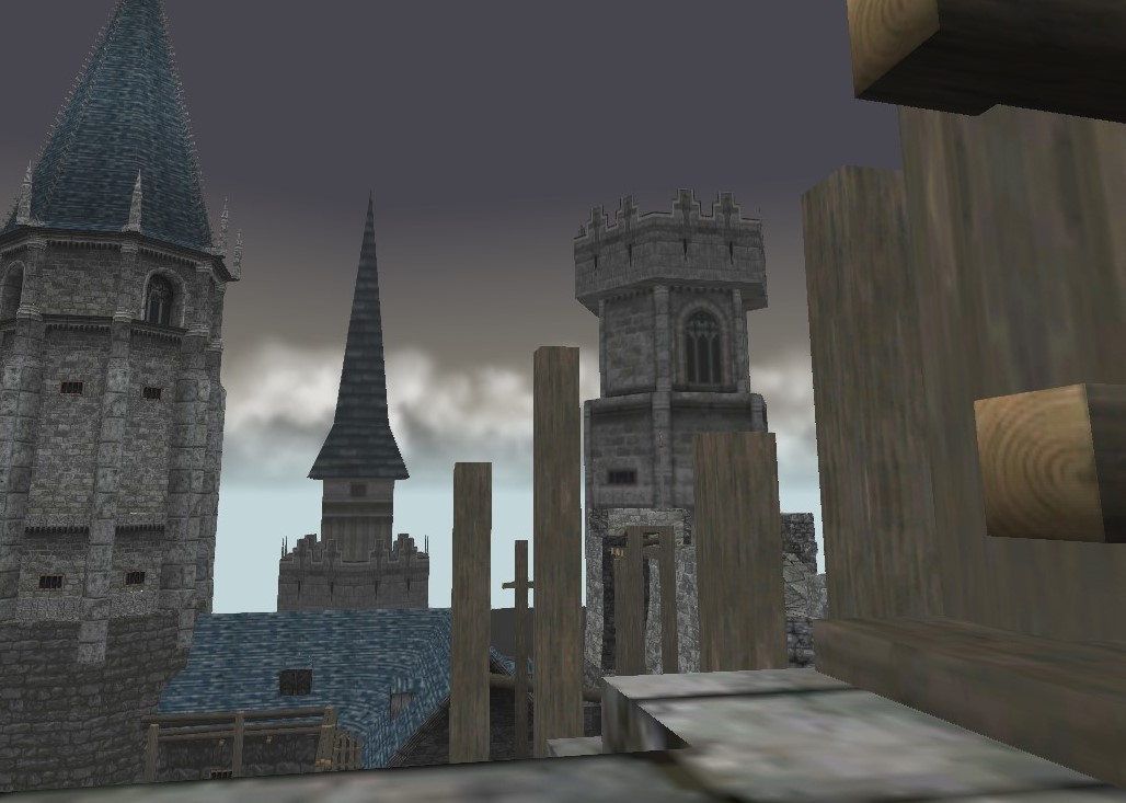 Raw 3D Model
 After applying in-game effects